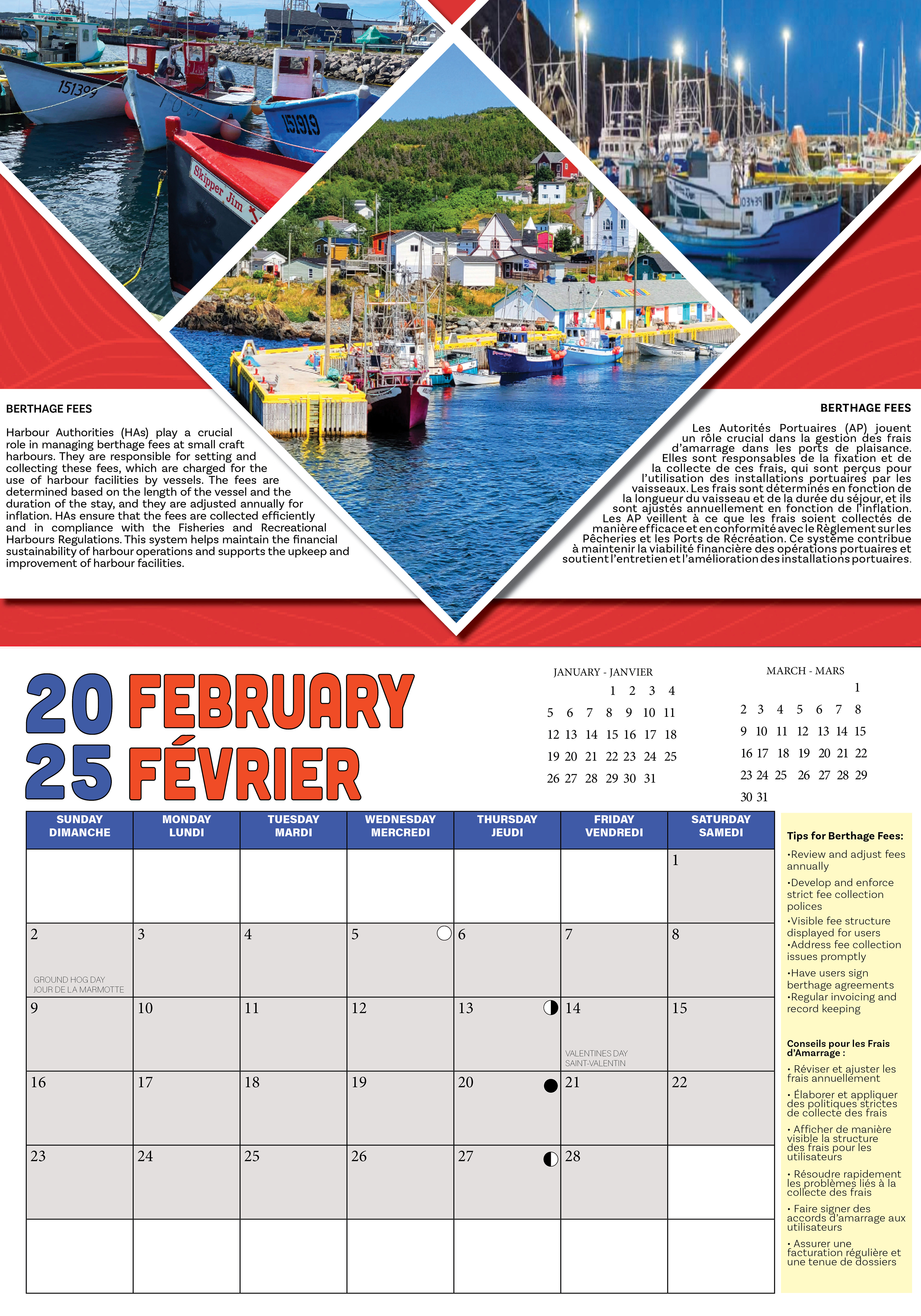
When I started this 2025 calendar project, my first step was brainstorming colour palette ideas. This project is done every year, but I noticed the past designs didn’t really reflect Newfoundland’s identity—and that’s the vibe I wanted to capture. So, I pulled my palette straight from the Newfoundland flag, incorporating bold tones of blue, orange, yellow, and red.
The design of the date grid was the second task. I wanted to make the year two digits on top of two digits instead of spelled out. I felt it was more appropriate for our typography choice. After experimenting with what colours to use for the year and the month, I started creating the grid. I had to leave room to add type on the grid half of the calendar, . so I made 3 different layouts to present to my team. They ended up choosing having the type on the right side of the grid
We decided on a grid layout with the text on the right side, a blue bar at the top for the days of the week, and small calendars for the previous and following months in the top right corner. To add more functionality, we also included special holidays and the moon cycle within the grid, and darkened the days of the month, while leaving the empty days white.
Next up was creating a layout for the feature pages that made my team happy. They wanted to feature multiple photos for each month, so I had to get creative to fit three images per page while still keeping everything clean and visually balanced.
With the layout finalized and each month categorized by theme, I added the final images and text to complete the calendar. Below is the final February spread, centered around the theme of berthing.